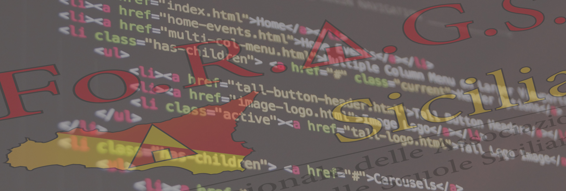
Fo.R.A.G.S. Sicilia
Forum Regionale delle Associazioni dei Genitori delle Scuole Siciliane
Project: Identity corporation
Brand research and realization of the identity corporation and the website.
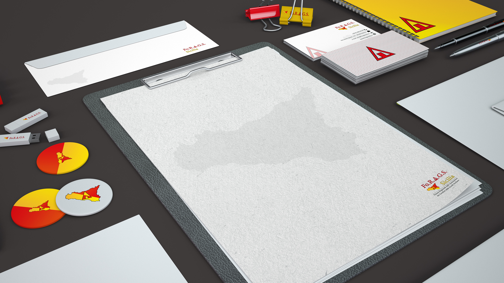
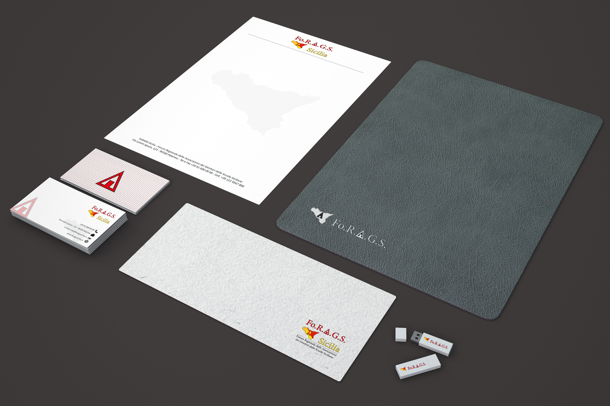
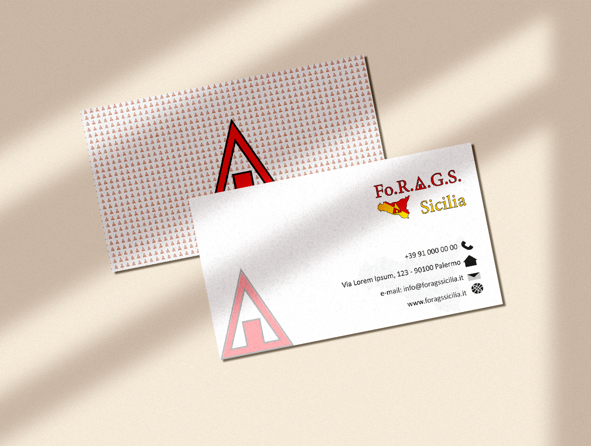
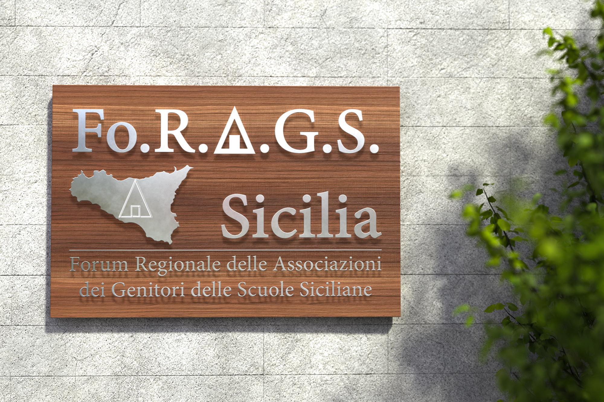
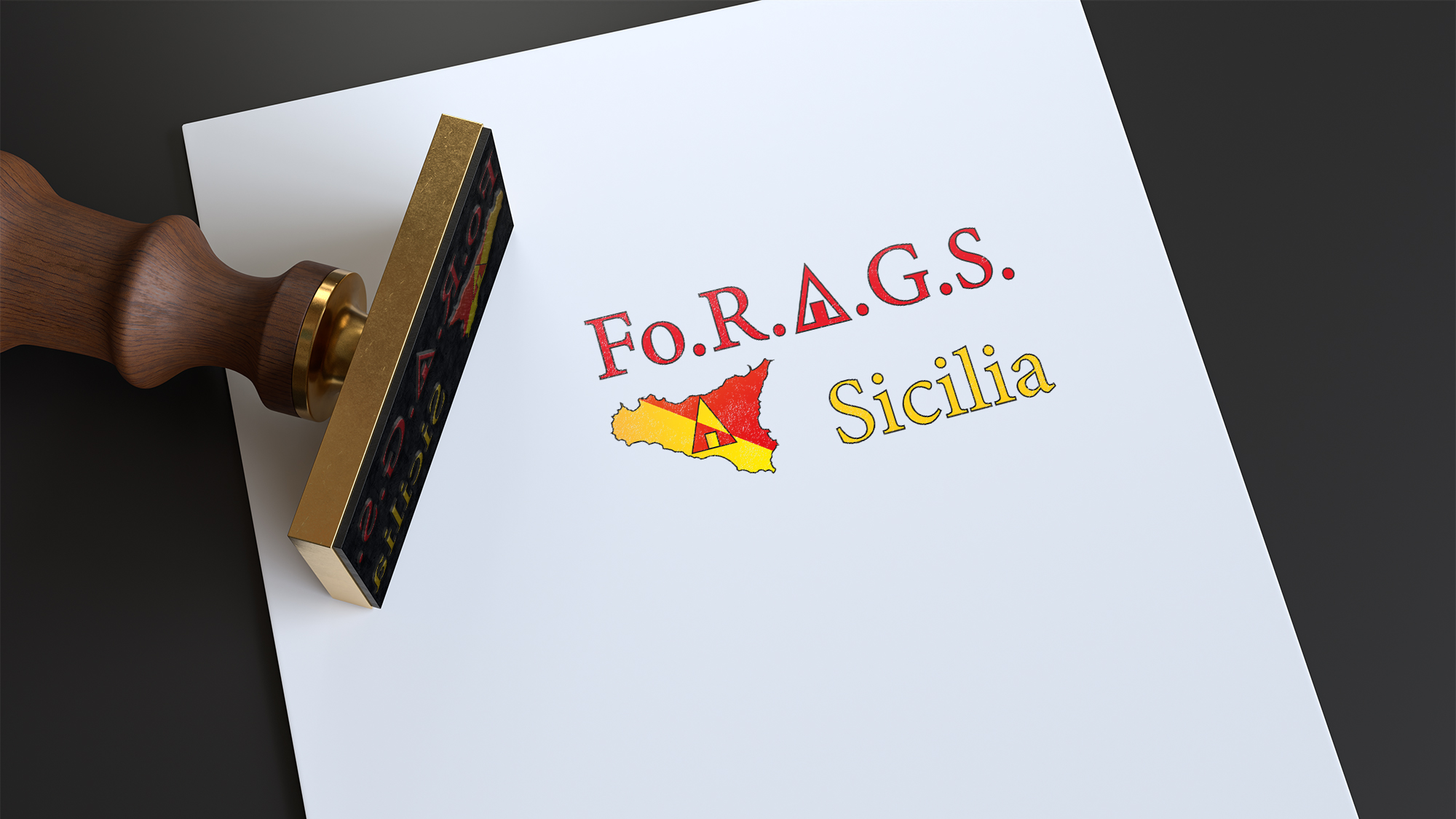
I reconstructed the letter "A" with a triangle and a rectangle to give originality to the logo and create an easily distinguishable and recognizable element to the point of being able to use it individually.
The dynamic shape of the triangle suggests growth, progress, action, movement, direction, while the rectangle represents safety, stability and reliability.
The message we intend to give is therefore to indicate the direction to go and act for change, ensuring safety and reliability.
Being an institutional association, I wanted to take up the colors of the Sicilian flag that color Sicily where the "A" once again stands out, also yellow and red but in negative compared to the background; at the same time red and yellow transmit energy respectively the first and optimism, clarity, trust the second.
See the Fo.R.A.G.S. website